

Updated: September 2026 · By the KKeyQik Team
PPC landing pages fix the most expensive sentence in paid advertising: “just send the traffic to our homepage.” Businesses spend thousands perfecting their ad targeting, then dump that expensive traffic on a generic page designed to do everything — and watch it convert nothing. A PPC landing page exists to fix exactly that: one ad, one promise, one page, one action. This guide explains why your ads deserve better than your homepage, what a proper one contains, and the sins we see in audits every month. (For the full engagement these pages plug into, see our guide to PPC management services.)
A PPC landing page is a standalone web page built for a single paid campaign — with one message matched to the ad that sent the visitor, one clear call to action, and nothing else competing for attention. Unlike your homepage, which serves every visitor and every purpose, it serves one visitor with one intent: the person who just clicked your ad. For official guidance, see Google Ads Help.
Key takeaways
- Sending paid traffic to a generic homepage is the most common landing page sin — and the most expensive, because you pay for every click the page wastes.
- Message match is the whole game: the page must continue the exact promise the ad made, in the visitor’s first three seconds on the page.
- It has one job and one call to action. Every element that doesn’t serve the conversion is friction — including your main navigation.
- You don’t need a page per keyword — you need a page per intent. Most small businesses need a handful of landing pages, not hundreds.
- Test the page before you blame the ads. A campaign with good click-through and bad conversion is usually a landing page problem, not a traffic problem.
Why Your Homepage Loses for PPC Landing Pages
Your homepage has an impossible job: welcome everyone, explain everything, and offer every path. That’s fine for organic visitors who are exploring. It’s fatal for paid visitors who arrived with a specific expectation. Someone who clicked an ad for “emergency plumber in Austin” doesn’t want your company history, your blog, and six service categories — they want a phone number, proof you’re real, and a reason to call now. Every second they spend orienting is a second closer to the back button — and you paid for the click either way. This is why dedicated PPC landing pages win.
The math is unforgiving: if your ads earn a 5% click-through rate but your homepage converts 1% of visitors, you’re paying for 100 clicks to get one lead. Fix the page to convert 3% and you’ve tripled your leads without touching the ads or spending a dollar more. The cheapest way to improve PPC performance is almost always the page, not the campaign. That’s why optimizing PPC landing pages pays off.
What Makes Dedicated PPC Landing Pages Different
Six things separate a dedicated landing page from every other page on your site: These principles make PPC landing pages convert.
- One intent. The page serves the single intent behind the ad group — not your whole business, not adjacent services.
- Message match. The headline echoes the ad’s promise in the visitor’s own words. Click “emergency plumber Austin,” land on “Emergency Plumber in Austin — 60-Minute Response.” No bait, no switch, no generic “Welcome to our website.”
- One call to action. A single conversion goal — call, form fill, booking — repeated at natural points down the page. Not three competing buttons.
- No escape hatches. Main navigation is removed or minimized. Every link that isn’t the CTA is an exit ramp you paid to build.
- Proof near the promise. Reviews, guarantees, credentials, and real photos placed where doubt appears — not buried on a testimonials page nobody visits.
- Speed and mobile-first. Paid traffic is overwhelmingly mobile and impatient. A page that loads slowly on a phone burns budget before it even renders.
Anatomy of High-Converting PPC Landing Pages
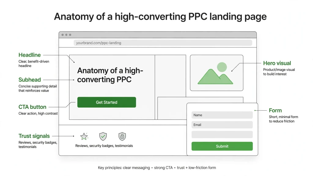
| Element | What good looks like |
|---|---|
| Headline | Matches the ad’s promise in the visitor’s words — specific, not clever |
| Subheadline | One supporting line: the outcome or the differentiator |
| Hero CTA | Visible without scrolling; the single action you want |
| Trust signals | Reviews, ratings, guarantees, credentials — real and specific |
| Benefits, not features | What the visitor gets, in their language — three to five, scannable |
| How it works | Three steps max. Remove the fear of the unknown. |
| Objection handling | Short FAQ-style block answering the top 3–4 doubts (pricing process, timing, guarantees) |
| Final CTA | Same single action, repeated after the case is made |
5 Sins We See Auditing PPC Landing Pages
- Homepage as landing page. The original sin — covered above, still the most common. If your campaigns point at your homepage, fix this before touching bids or budgets.
- Message mismatch. The ad promises one thing, the page talks about another. Even small mismatches (“24/7 service” in the ad, business hours buried on the page) destroy trust instantly.
- Asking for too much. A first-visit form with eight required fields is an interrogation, not a conversion. Ask for the minimum that lets you follow up — name, phone or email, and the one qualifying detail.
- Stock photos of strangers. Visitors deciding whether to trust you with their money respond to real faces, real work, real places. Generic stock imagery signals a generic business.
- No proof above the fold. Reviews and guarantees buried three scrolls down might as well not exist. Doubt strikes in the first seconds — that’s where proof belongs.
Homepage vs Dedicated PPC Landing Pages
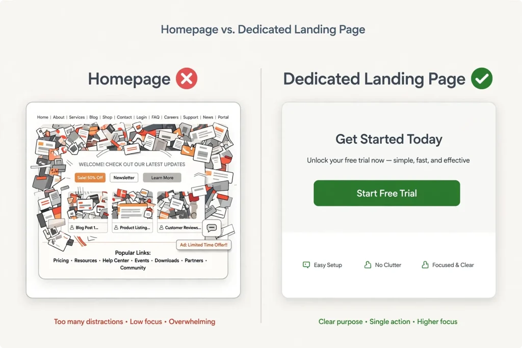
| Homepage | Dedicated landing page | |
|---|---|---|
| Job | Orient every visitor | Convert one intent |
| Navigation | Full menu — explore freely | Removed — one path forward |
| Headline | Brand-level, general | Matches the ad, specific |
| Calls to action | Several, for different visitors | One, repeated |
| Right for | Organic visitors, brand searches | Paid traffic with clear intent |
How to Brief Whoever Builds Your PPC Landing Pages
Whether it’s your agency, a freelancer, or your own team — hand them this brief and you’ll get a real landing page instead of a prettified homepage: A good brief produces better PPC landing pages.
- The ad groups this page serves, and the exact search terms or audiences behind them.
- The one conversion action — and the minimum information you need to follow up.
- Your three strongest proof points: best reviews, guarantees, credentials, numbers.
- The top four objections prospects raise before buying — answered in their words.
- What happens after conversion: who follows up, how fast, and what the prospect should expect.

Ready to talk about your PPC?
If your ads point at your homepage, you already know what to fix — and it’s usually the highest-ROI fix in the entire account. Contact the KKeyQik team and tell us where your paid traffic lands today. We’ll reply honestly with what’s costing you conversions — and what a proper landing page would change.
Further reading: our complete guide to PPC management services — what’s included, how engagements are structured, and how to choose an agency.
About the KKeyQik Team
KKeyQik is a digital marketing agency helping small businesses grow with SEO, social media marketing, PPC (Google Ads and Meta Ads), web development, video editing, and graphic design. The KKeyQik Team publishes practical, no-fluff guides for business owners who want marketing that pays for itself. Our PPC landing pages follow this framework.
Frequently Asked Questions
Brand-name campaigns where the visitor already trusts you, and campaigns with exploratory intent where browsing is the point. These are the exception, not the rule — anything with a specific promise in the ad still deserves a dedicated page. When in doubt, check your conversion rates: if homepage traffic converts, keep it; if not, the dedicated page wins.
Message match means the landing page headline continues the exact promise the ad made, in the visitor's own words. If the ad says 'emergency plumber in Austin,' the page should open with something like 'Emergency Plumber in Austin — 60-Minute Response,' not a generic welcome message. Even small mismatches, like '24/7 service' in the ad and business hours buried on the page, destroy trust instantly.
Yes. Every link that isn't your call to action is an exit ramp you paid to build, and a paid visitor with a clear intent has no reason to browse your whole site. Removing or minimizing navigation keeps the visitor on the single path the ad promised. Your homepage remains the place for explorers; the landing page exists to convert one intent.
You need a page per intent, not a page per keyword. Group your ad campaigns by what the searcher actually wants — emergency service, scheduled service, and quote requests are different intents — and build one page for each. Most small businesses need a handful of landing pages, not hundreds.
Test the page before you blame the ads. A campaign with a healthy click-through rate but weak conversions is usually a landing page problem, not a traffic problem — the ads are doing their job of attracting the right people, and the page is failing to close them. Fixing the page is often the cheapest way to improve PPC performance, frequently multiplying leads without changing bids or budgets.
A first-visit form with eight required fields feels like an interrogation, not a conversion. Ask for the minimum that lets you follow up — typically a name, a phone number or email, and one qualifying detail. You can collect the rest later in the conversation, after the visitor has already said yes.
Trust signals — reviews, ratings, guarantees, credentials, real photos — belong where doubt appears, which is usually near the top of the page, not buried three scrolls down. Doubt strikes in the first seconds, so proof placed that late might as well not exist. Put specific, verifiable proof next to the promise it supports.
Visitors deciding whether to trust you with their money respond to real faces, real work, and real places. Generic stock imagery signals a generic business and quietly tells the visitor you might be hiding something. Real photos of your team, your work, and your location build the credibility that stock photography can't.
A strong brief specifies one intent, message match with the ad, a single call to action repeated down the page, proof placed near the promise, and speed and mobile-first design. Hand that brief to an agency, a freelancer, or your own team and you'll get a real landing page instead of a prettified homepage.
Enormously. Paid traffic is overwhelmingly mobile and impatient, and a page that loads slowly on a phone burns budget before it even renders — you've paid for a click that never saw your offer. Speed and mobile-first design aren't technical luxuries; they're conversion fundamentals for any page receiving paid traffic.