

Updated: October 2026 · By the KKeyQik Team
Your packaging is often the first physical experience a customer has with your brand. Before anyone reads a review or visits your website, they see a box, pouch, jar, or label and make a quick judgment about quality, fit, and trust. That is why graphic design services for small business should treat packaging as both a design project and a production project. Good packaging design for small business work balances shelf presence, clear information, and print accuracy, so what looks right on screen still looks right in a customer’s hands.
We approach packaging as a system, not a one-off label. A single product may launch with one flavor or scent, then grow into a full line. The structure, materials, colors, and type hierarchy need to work today and still hold together when you add variants, new sizes, or seasonal editions. This guide walks through what packaging has to do, how the process moves from concept to shelf, the print basics that affect the final result, labeling considerations for US categories, and the mistakes we see most often.
Key Takeaways
- Effective packaging balances shelf impact, clear information hierarchy, and consistent brand recognition.
- A structured process from research to print-ready files reduces revisions and production issues.
- Structure, materials, color setup, and dielines should be decided early, not after the artwork is finished.
- US labeling requirements vary by category, so verify current rules for your product before finalizing copy.
- Designing a flexible SKU system from the start makes future flavors, sizes, and editions easier to manage.
What Packaging Has to Do
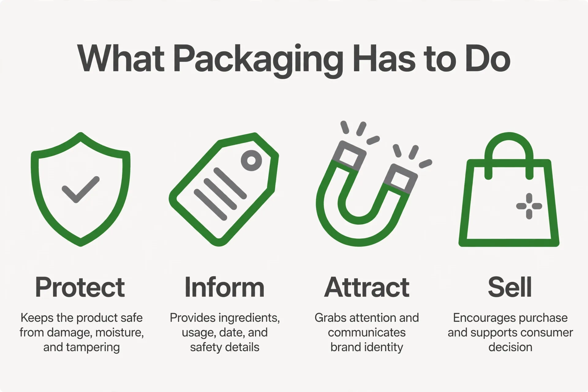
Packaging has several jobs at once. It protects the product, communicates what it is, helps the right buyer find it quickly, and reinforces your brand. When one of those jobs is weak, the others suffer. A beautiful pack that hides the product name creates confusion. A highly informative pack with no visual hierarchy feels cluttered and gets overlooked.
Shelf impact
On a physical shelf or in an online thumbnail, your product sits next to alternatives. Shoppers scan quickly, so the pack needs a clear focal point. That might be the product name, a distinctive color block, a simple illustration, or a recognizable brand mark. The goal is not to be the loudest item in the aisle. The goal is to be easy to spot and easy to understand at a glance. Strong contrast, generous white space, and a limited color palette usually read better at a distance than dense decoration.
Information hierarchy
Once someone picks up the pack, the information hierarchy takes over. The most important details should be obvious first: what the product is, who it is for, and any key differentiator. Secondary information, such as usage directions, ingredients, or care instructions, should be organized so it can be found without hunting. We use type size, weight, spacing, and placement to guide the eye in a logical order. If everything is emphasized, nothing is emphasized.
Brand recognition
Consistent use of your logo, colors, typography, and imagery helps customers recognize your products across different stores, photos, and product lines. Recognition builds over repeated exposure. When each SKU looks like it belongs to the same family, a customer who liked one product can find the next one faster. That consistency also supports your other materials, from your website to social graphics, so the brand feels connected at every touchpoint.
Recognition also depends on how primary and secondary packaging work together. The outer carton, inner container, seal, and shipping materials may all carry different amounts of information, but they should share a recognizable visual language. A customer who first sees a product in a social post, then encounters it in a store or receives it by mail, should understand immediately that it is the same brand. Planning those layers together avoids a mismatch between an attractive outer box and a plain or confusing inner label. It also helps your team keep photography, listings, and retail displays consistent as new sales channels are added.
Unboxing and second life
For direct-to-consumer orders, the shipping box and inner packaging shape the unboxing experience. Clear opening cues, protective inserts that fit properly, and a concise thank-you or instruction card can make the product easier to use and reduce confusion. Some packaging also gets a second life as storage or display. Designing with that in mind means choosing durable materials, avoiding excessive ink coverage where it will scuff, and keeping essential information visible even after the outer sleeve is removed.
From Concept to Shelf: The Process
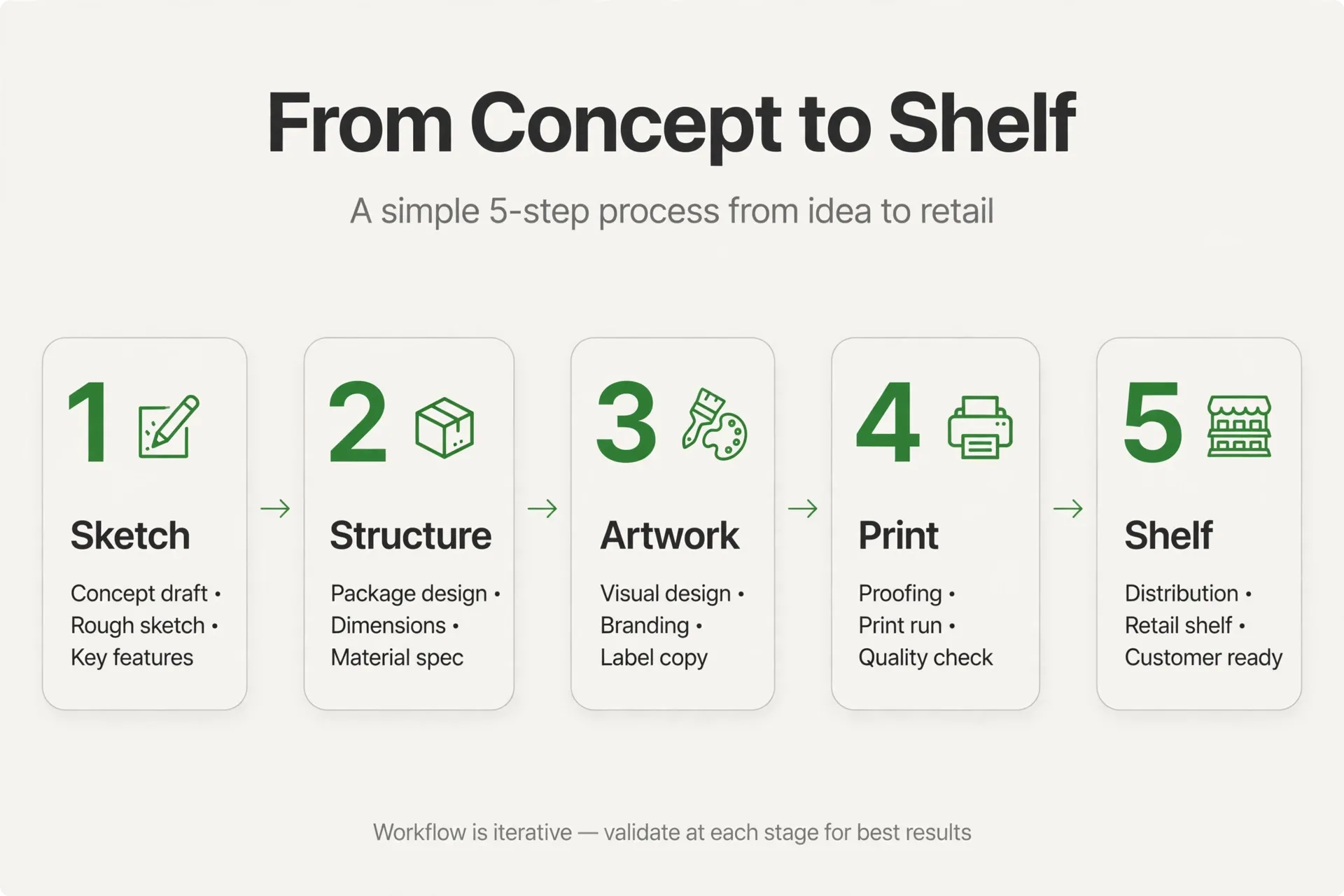
We follow a step-by-step process so creative decisions and technical decisions stay aligned. Skipping the early steps often leads to attractive concepts that cannot be printed cleanly, do not fit the product, or need to be rebuilt when variants are added.
- Research and shelf review. We start by looking at where the product will be sold, what sits next to it, and what customers need to understand quickly. We review your current brand assets, product sizes, and any regulatory copy that must appear. This stage defines the pack dimensions, the amount of copy, and the visual direction.
- Structure and materials. Next we confirm the physical format: box, pouch, bottle label, jar, tube, or another structure. Material choice affects print results, durability, and how colors appear. We also confirm how the product will be filled, sealed, shipped, and displayed, because those factors influence panel layout and where information can safely sit.
- Concept design. With the structure set, we develop initial design directions. Each concept explores hierarchy, color, typography, and imagery while using the real dieline, so the layout fits the actual panels, folds, and seams. We present concepts with mockups that show the front, back, and sides together, not just a flat front view.
- Refinement and variants. We refine the chosen direction, tighten the copy layout, and build out the variant system. This is where flavor colors, scent cues, size differences, and other SKU distinctions are defined. We check that each variant is distinguishable at a glance while still clearly part of the same family.
- Print-ready and production. The final stage is preparing print-ready files. We check image resolution, color setup, fonts, dieline layers, bleed, and safe areas. We also provide a clear file handoff so your printer or co-packer receives the correct versions. A final proof review helps catch spacing, spelling, or barcode placement issues before the full run.
Timelines vary based on the number of SKUs, the amount of copy, and how quickly approvals and printer proofs move. Building in time for a physical proof is worthwhile, because screen colors and material finishes can look different in person.
Structure, Materials & Print Basics
Understanding a few print fundamentals helps you make better design decisions and communicate clearly with your printer. You do not need to become a production expert, but knowing what a dieline is and how color works will save revisions later.
Dielines explained
A dieline is the flat template that shows where the packaging will be cut, folded, and glued. It is similar to a sewing pattern for a box or label. The dieline includes panel boundaries, fold lines, bleed areas that extend beyond the trim, and safe zones where important text and logos should stay away from edges and folds. Artwork must be built on the correct dieline for the exact structure and size you ordered. Using a generic rectangle instead of the supplier’s dieline is a common source of misaligned panels and cropped text.
Color: CMYK and spot colors
Printers typically print using CMYK, a four-color process. Some projects also use spot colors, which are premixed inks chosen for consistency, especially for a signature brand color. Colors can shift depending on the material: the same ink may look different on uncoated cardboard, glossy film, or clear labels. That is why we recommend reviewing printed proofs on the actual material when color accuracy matters. What you see on a backlit monitor will not match print exactly.
Finishes and material choices
Finishes affect both appearance and handling. Matte surfaces tend to reduce glare and can feel understated, while glossy surfaces can make colors appear more saturated. Textured or soft-touch coatings change how the pack feels in hand. Foil or embossing can highlight a specific element, such as a logo, but should be used selectively so the hierarchy stays clear. Material weight and rigidity also matter: a thin carton may work for a lightweight item but feel flimsy for a heavier product. We discuss these choices in qualitative terms with clients and printers, focusing on durability, print quality, and brand fit rather than trends alone.
| Design element | Why it matters | Common pitfall |
|---|---|---|
| Dieline accuracy | Ensures artwork aligns with cuts, folds, and seams | Designing on the wrong template and cropping key text |
| Information hierarchy | Helps shoppers identify the product and key details quickly | Too many competing messages on the front panel |
| Color setup | Affects consistency across materials and reprints | Approving color on screen only, without a print proof |
| Barcode placement | Allows reliable scanning at checkout and in warehouses | Placing the barcode over a fold, seam, or busy image |
| Variant system | Lets customers distinguish flavors or types at a glance | Using color alone with no text difference between SKUs |
Good packaging design for small business projects also accounts for how the pack will be photographed. Online listings often show a small thumbnail, so the product name and primary visual should remain legible when reduced in size. Testing a mockup at thumbnail scale is a simple way to check readability before you commit to print.
It is also worth agreeing on file ownership and version control before production begins. Your final package should include clearly named print files for each SKU, a copy of the dieline used, and records of the approved colors and materials. When you change suppliers or add a product later, those files make it easier to reproduce the design accurately. We recommend keeping an approved proof with the production files so future reprints can be compared against the version you signed off, rather than recreated from screenshots or older drafts.
Labeling & Compliance Basics
Labeling requirements in the US depend on what you sell and how it is sold. Food, dietary supplements, cosmetics, and household products each have their own rules, and those rules can change. The information below is general guidance to help you plan your layout. It is not legal advice, and you should confirm current requirements for your specific category with your regulatory advisor or the relevant agency before finalizing your packaging.
For food products, brands typically need to plan space for elements such as the product identity, net quantity, ingredient information, and manufacturer or distributor details, among other items. The US Food and Drug Administration provides food labeling guidance that outlines these requirements in detail. You can review the FDA’s food labeling and nutrition resources as a starting point for understanding what may apply to your product.
Cosmetics and personal care products have different labeling considerations, and claims on the pack can affect what must be included. If your product makes specific claims, those claims may trigger additional requirements. Because panel space is limited, it helps to gather all required copy early in the process, before the layout is finalized. Adding mandatory text at the end often forces cramped type or a redesign of the back panel.
We design the layout to accommodate the copy you provide and leave clear zones for required elements, but we do not determine what your product is legally required to state. A practical workflow is: confirm your required label elements, estimate the space they need, share that with the designer, and then review the final proof against your compliance checklist. This sequence reduces the risk of discovering a missing element after files have been sent to print.
Designing for Variants & Growth
Many small brands launch with one product and add more within the first year. Designing a flexible system from the beginning makes that growth much smoother. Instead of treating each new flavor or size as a separate design project, we define rules for what stays constant and what changes.
Flavor and SKU systems
The constant elements usually include logo placement, layout structure, typography, and the overall color framework. The variable elements might be an accent color, a flavor name, an icon, or a product image. This approach keeps the line looking unified while making each variant easy to identify. We also recommend not relying on color alone to differentiate SKUs. Adding a clear text label or icon helps customers who view the product in low light, in a small online image, or who have difficulty distinguishing certain colors.
Limited editions and seasonal runs
Limited editions work best when they feel special but still recognizable as part of your brand. A seasonal color shift, a temporary illustration, or a special finish can signal that the edition is different without rebuilding the entire pack. Planning for these runs early helps you decide which elements can change without affecting the barcode, required copy, or structural layout.
Line extensions
When you extend into a related category, such as moving from a core product to a complementary one, the packaging should signal both continuity and difference. Customers should be able to tell that the new item comes from your brand and understand how it differs from the original. Consistent structure and typography provide continuity, while a distinct color family or panel layout can mark the new line. Planning the naming and hierarchy for extensions early prevents confusion as the range grows.
Mistakes That Cost Small Brands
Most packaging problems we see are preventable. They usually come from rushing the technical steps or trying to fit too much onto the pack.
Dense, cluttered packs
Adding every possible benefit, badge, and claim to the front panel makes the pack harder to read. Shoppers cannot tell what matters most, so they move on. Prioritize a few key messages on the front and move supporting details to the back or side panels where they can be read comfortably.
Low contrast and small type
Light text on a light background or thin type at a small size may look refined on screen but becomes hard to read in real lighting. The Web Content Accessibility Guidelines explain that text should maintain sufficient contrast to remain legible. The W3C guidance on contrast minimum provides a useful reference for thinking about readability, even though it was written for digital content. Applying the same principle to print helps ensure your product name and key details stay readable.
Ignoring print constraints
Designs that ignore bleed, safe areas, or material limitations often need last-minute fixes. Text placed too close to a fold can crack or disappear into a seam. Images that do not extend into the bleed area can leave white edges after trimming. Building on the correct dieline and reviewing a physical proof helps catch these issues early.
No planned barcode space
Barcodes need a clear, flat area with enough quiet space around them to scan reliably. Forgetting to reserve that space can force the barcode onto a curved surface, over an image, or across a fold. We include barcode placement in the initial layout so it does not become an afterthought.
Inconsistent variant design
When each SKU is designed separately, the line can start to look fragmented. Customers may not realize the products are related, and retailers may display them inconsistently. A defined variant system keeps the range cohesive as it expands.
Further Reading
- Graphic Design Services for Small Business: What Is Included and How It Works
- Brand Identity Design: What’s Included Beyond the Logo
- Logo Design for Small Business: Process, Deliverables & Timelines
Ready to Talk About Your Packaging?
If you are planning a new product or reviewing your current packaging, we can help you map the structure, design the system, and prepare files your printer can use with confidence. Tell us about your product, your timeline, and where you plan to sell, and we will outline the next steps.
Get in touch with our team to start the conversation.
Frequently Asked Questions
A dieline is the flat template that shows where your packaging will be cut, folded, and glued. It marks panel sizes, fold lines, bleed, and safe areas for text. Your designer builds the artwork on this exact template so nothing important lands on a fold or gets trimmed off. Always request the dieline from your printer or packaging supplier before design work begins, because using the wrong size leads to misaligned panels and costly reprints.
Print-ready means the final file is prepared exactly as your printer requires. That usually includes the correct dieline, CMYK or specified spot colors, outlined or embedded fonts, high-resolution images, bleed on all trimmed edges, and clearly labeled layers for cuts and folds. A print-ready file is checked against a proof so spacing, spelling, and barcode placement are confirmed before the full production run starts.
We build a system where core elements stay constant and specific elements change. Logo placement, layout structure, and typography remain the same across the line, while an accent color, flavor name, icon, or image identifies each variant. This keeps the range recognizable as one brand while helping customers distinguish options quickly. We also avoid relying on color alone, adding clear text cues so variants remain easy to tell apart.
Requirements depend on your product category and how it is sold. Food, supplements, cosmetics, and household products each have different rules in the US, and those rules can change. Common elements include product identity, net quantity, and manufacturer details, but you should confirm the exact requirements for your category with a regulatory advisor or the relevant agency before finalizing your label copy. We design the layout around the approved copy you provide.
Yes, and many brands do. A practical approach is to plan the new design while existing inventory sells through, then transition at a natural reorder point. Keep key recognition elements, such as your logo and core colors, so loyal customers can still find you. If the change is significant, a brief note on the pack or your website explaining the new look can help reassure existing buyers during the transition.
Material choices involve trade-offs between durability, product protection, print quality, and recyclability or compostability in your area. Paper-based options, reduced plastic, and refill formats each behave differently in production and shipping. We recommend discussing options with your packaging supplier, confirming that the material protects your product properly, and checking that any environmental claims on the pack are accurate for how the material is actually handled where your customers live.
Timelines vary depending on the number of products, the amount of label copy, and how quickly feedback and proofs move. A single product with finalized copy moves faster than a multi-SKU line that needs a variant system. Printer proofs and any compliance review also affect timing. We recommend building in time for a physical proof on the actual material, because colors and finishes can look different in person than on screen.
Testing helps reduce risk. A physical proof shows how colors, finishes, and type look on the real material. You can also check readability at shelf distance and in small online thumbnails. Gathering feedback from a few target customers on clarity and appeal can highlight confusion before you invest in volume. Catching a hierarchy or legibility issue at the proof stage is far simpler than correcting it after production.
CMYK is a four-color printing process that builds colors from cyan, magenta, yellow, and black inks. A spot color is a premixed ink used for a specific shade, which can help a signature brand color stay consistent across different print runs and materials. Your printer can advise which approach suits your project. In either case, reviewing a printed proof on your chosen material is the most reliable way to check the final appearance.
Yes. Retail and e-commerce place different demands on packaging. In stores, shelf impact and quick recognition matter. Online, the pack needs to read clearly in a small thumbnail and withstand shipping. We design with both contexts in mind, checking that the product name and key visual remain legible at small sizes while the physical structure protects the product in transit and presents well when it arrives.